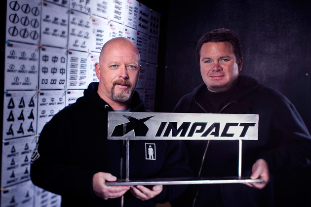
A brand is a singular idea or concept that you own inside the mind of your customer. And your logo, is the first and most important impression your company makes. It is the visual representation of your brand. When we took on the challenge of reintroducing Impact as the premiere automotive safety brand, we started with the logo. We updated the look and feel and made it stronger, by developing a custom hand built font. We then paired it with a unique mark we dubbed “The Crossroads.” During this process we explored hundreds of variations in an effort to ensure we tested every possible shape, color, and meaning. The mark we created is a road junction that implies speed, power, and strength. It represents the moment when a driver has to make a critical decision that will decide his fate.

